Patterned by Adrianne
Overview
Patterned by Adrianne is my data portfolio, built as a space for data storytelling, analysis, and visual communication. Rather than treating it as a gallery of charts or a technical dashboard alone, I wanted it to function as a place where datasets can be translated into readable, narrative-driven projects.
The Goal
- Create a dedicated home for my data analytics and storytelling work
- Present datasets and findings in a way that is clear and approachable
- Build a portfolio that balances technical analysis with strong written communication
Context
I originally enrolled in a Data Analytics cohort with Merit America in 2023, with the goal of transitioning into a data-focused career. At the time, I built an initial data analytics portfolio hosted on my main domain, adrianne.io, as a way to showcase my work at the end of the program.
As I continued learning and building, I began to rethink how my projects were organized. Instead of keeping everything under a single site, I decided to restructure my work into a multi-site portfolio system. This led to the creation of a central portal on adrianne.io, with dedicated sites for different areas such as data analytics, coding and technical writing, and AI.
Patterned by Adrianne is a rebuilt and reimagined version of my original data portfolio, designed to give data analysis its own focused space within this ecosystem.
When rebuilding the site, I also wanted to use it as a chance to practice Tailwind CSS in a real project. This made Patterned by Adrianne not just a portfolio rebuild, but also a learning exercise in applying a newer frontend workflow to an actual design.
What I Built
- A dedicated portfolio site for data analysis and storytelling
- A homepage introducing the purpose and tone of the project
- A structure for future case studies, dashboards, and data-focused writeups
Design Direction
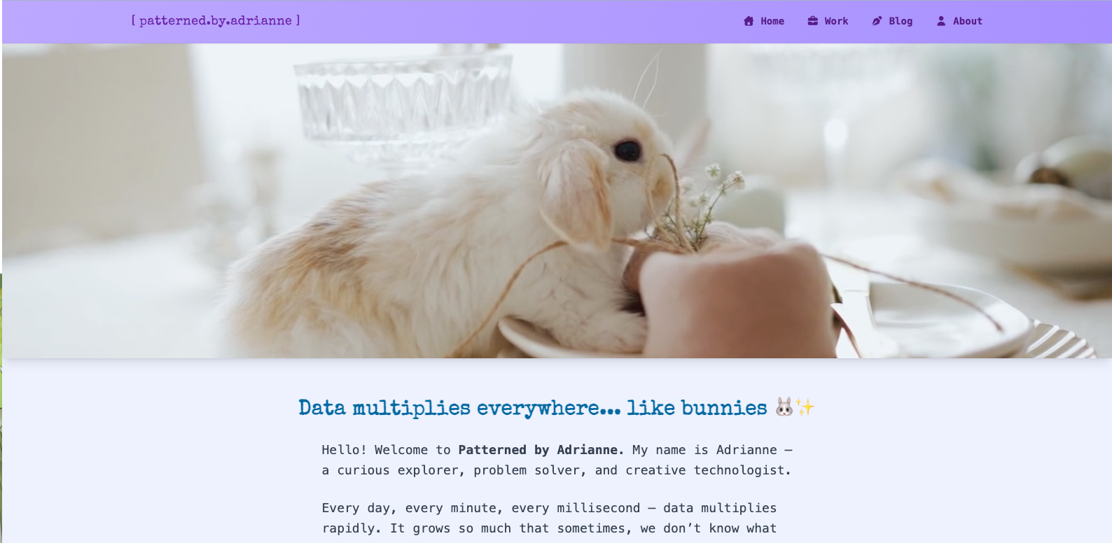
The visual direction also incorporates a playful metaphor to represent how data behaves.
Rabbits are known for their rapidly growing populations, which parallels how data multiplies quickly and continuously. This idea is reflected both in the bunny-themed visuals and in the animated hero element, where a bunny repeatedly munches in a loop.
The animation subtly communicates constant activity and growth, reinforcing the concept of ongoing data generation and consumption. This approach replaces more traditional “live dashboards” with a softer, more approachable form of visual storytelling.
The choice of a bunny theme is also personal and intentional. I wanted the site to reflect my own creative preferences, while also challenging the expectation that data analytics portfolios must feel plain or overly technical. By using a fun but relatable theme, the site invites curiosity without sacrificing depth, allowing serious topics like data cleaning, analysis, and storytelling to feel more accessible. Other metaphors, such as honeybees, could have worked for representing growth, but bunnies provided a clearer and more immediately recognizable connection.
Tech Stack
- Hugo — used to generate a fast static site that can support content-heavy analysis and long-form writeups
- Tailwind CSS — used to rapidly prototype layout and utility-based styling while maintaining consistency across components
- Custom CSS — used to shape the site’s visual identity, spacing, and editorial presentation
Challenges
- Defining the site as a data storytelling space rather than just a collection of charts
- Balancing readability with technical credibility
- Designing a structure that can support future analysis projects without feeling too rigid or dashboard-heavy
- Trying to build an earlier sidebar layout while still learning Tailwind CSS in a real project
- Aligning the animated bunny hero with a fixed navigation layout without making the page feel awkward or unstable
Solutions
I approached the site as a writing and storytelling platform first, with data visualization serving as support rather than the entire experience. This helped shape both the layout and the tone of the site.
Instead of building a dashboard-style interface immediately, I focused on creating a calmer structure that would allow case studies and data narratives to grow over time. This made the site more flexible and better aligned with the kind of work I want to publish there.
An earlier version of the site used a sidebar layout similar to Adrianne Codes, but that approach became difficult to maintain while I was still learning Tailwind CSS and experimenting with the animated hero section. After multiple layout and alignment issues, I decided to simplify the structure by switching to a horizontal navigation and a one-column layout. That change made the design easier to manage and better suited to the calmer, editorial feel I wanted for the site.
What I Learned
- Data portfolios do not need to look like dashboards to be effective
- Clear writing is just as important as charts when presenting analysis
- A strong structure helps make technical material more approachable
- Learning a new CSS framework is easier when paired with a real project, but it can also expose layout decisions that need to be simplified
- Sometimes changing the layout entirely is a better solution than forcing an earlier design that no longer fits the project
- Data storytelling and explanation can be just as valuable as interactive dashboards when communicating insights
- While I have experience with tools like Tableau, I chose to focus this project on data storytelling and written analysis rather than dashboard-driven presentation
What I’d Improve Next
- Add full data case studies and analysis posts
- Expand the visual system for future charts and storytelling sections
- Refine how projects, dashboards, and written insights are organized as the site grows