Adrianne Codes - Portfolio Build
Overview
Adrianne Codes is my personal coding and technical writing portfolio. I built this site to document both my projects and what I learn as I continue developing my skills.
Rather than treating it as a static portfolio, I wanted this site to function as a living space where case studies, tutorials, and notes can evolve over time.
The Goal
- Build a clean and readable portfolio site
- Create a space for case studies and tutorials
- Develop a reusable layout and component system
- Keep the site lightweight and easy to maintain
- Use minimal imagery, relying on screenshots, emojis, and CSS for visual design
Context
Adrianne Codes was first built in 2021 as a rework of my earlier coding portfolio and tutorials site, The NinpoJINEOUS (ninpojineous.ninja). Since then, it has gone through several iterations.
The site originally ran on WordPress, then later moved to Hashnode when I no longer had the time to maintain a backend.
During that phase, my writing shifted away from coding-focused documentation. I found myself writing more about adjacent topics, including my Data Analytics cohort and broader discussions around web development as AI began to emerge.
After exploring AI tools and building my prompt engineering portfolio, I also rebuilt my data analytics portfolio under a new site, along with a central portal to connect everything. This shift helped me become more productive and, in many ways, reawakened my interest in web development.
As a result, I decided to bring Adrianne Codes back as a dedicated, stand-alone portfolio — focused on coding projects and technical writing through simple tutorials and “learn as you go” documentation.
What I Built
- A multi-page portfolio site using Astro
- Reusable components such as navigation, footer, and project cards
- A content shell system for different page types (reading vs. section pages)
- A contact page using inline SVG icons for a clean, minimal layout
- A projects page that acts as a hub for my broader site ecosystem
- A headless CMS setup powered by the Hashnode API, used specifically for the Tuts and Learn sections
Design Direction
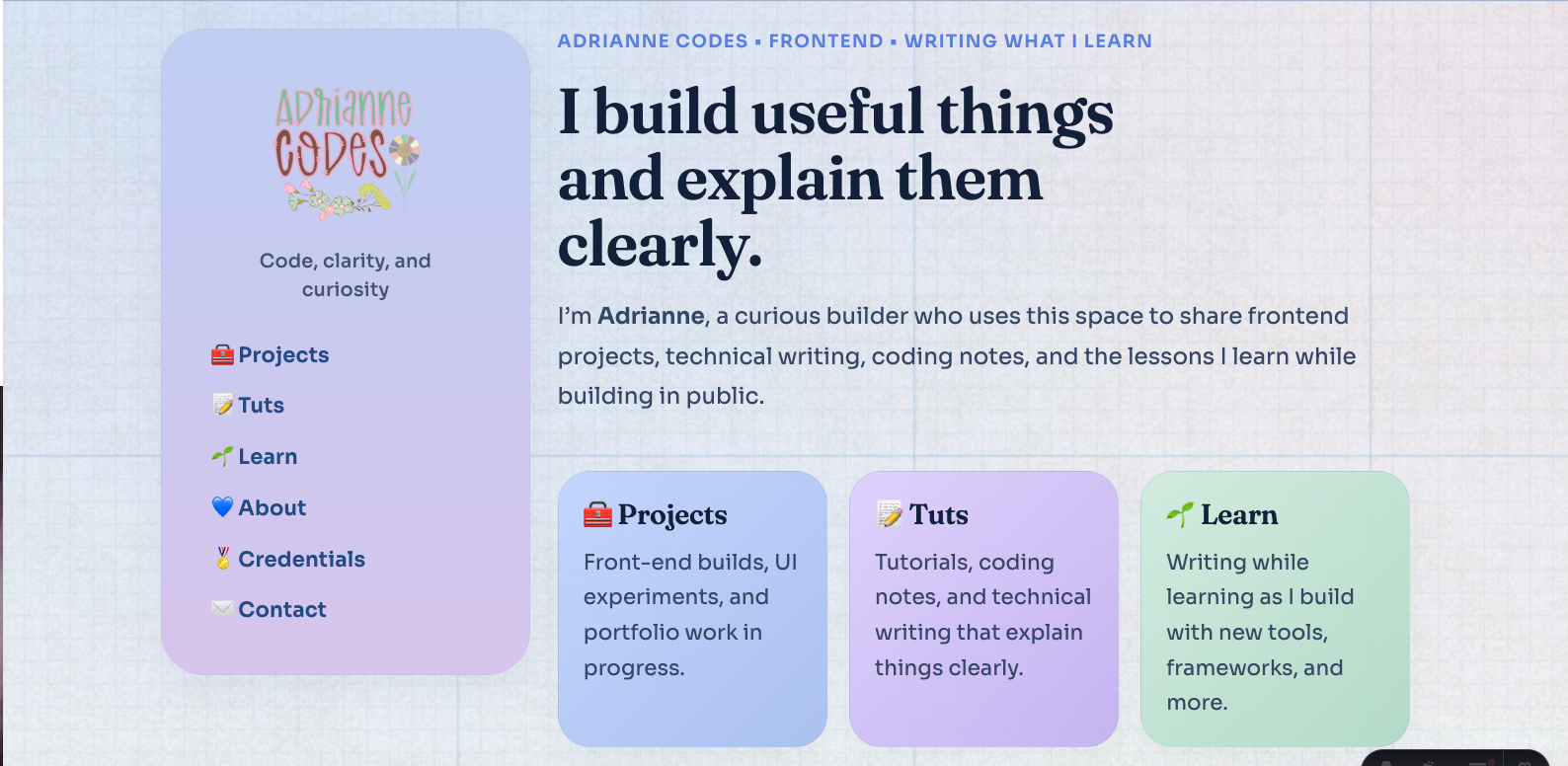
The visual and UX direction of Adrianne Codes is centered around clarity, readability, and a soft, approachable aesthetic.
The layout is built around a two-column structure, with a fixed sidebar for navigation and a main content area for each section. This allows navigation to remain consistent while the content adapts depending on the page type.
The site uses a content shell system to differentiate between sections. Reading-focused pages use a clean white shell to prioritize readability, while section pages use soft-colored shells to create visual distinction and hierarchy across the site.
The color system is pastel-inspired, using soft tones and subtle contrast to create a calm and inviting interface. Rather than relying on heavy visual effects, the design focuses on spacing, structure, and gentle color accents.
Typography is chosen for both personality and readability. Headings use Fraunces to create a distinct visual identity, while body text uses a clean sans-serif for clarity across longer content.
Interaction is intentionally minimal. The site prioritizes straightforward navigation and scannable content, especially for case studies and tutorials. Visual elements such as cards and links are designed to feel interactive without overwhelming the user.
The design also accounts for different types of content, including case studies, tutorials, and learning notes, ensuring each remains readable while still feeling part of a unified system.
Overall, the design aims to balance a cozy, personal aesthetic with a structured, professional layout that supports long-form technical content.
Tech Stack
-
Astro — I had previously used Hugo for building smaller sites, but after reading more about Astro, I found that it is well-suited for content-heavy sites such as documentation and portfolios. Astro also provides a simpler and more flexible approach for building component-based layouts. Astro also allows me to separate content from presentation more cleanly, which fits the structure of this portfolio.
-
Pico CSS — After struggling with Tailwind CSS, I explored classless CSS and Modern CSS while building both index.adrianne and Portal by Adrianne using Paper CSS and Terminal CSS. Pico CSS is lightweight and simple, and I chose it as a starting point to help me transition into writing more custom, modern CSS.
-
Custom CSS — Pico CSS does not include my preferred pastel or kawaii aesthetic by default. While it provides a solid foundation, I extended it using custom styles. This also gave me the opportunity to learn and apply modern CSS techniques, such as CSS variables and reusable design patterns.
-
Iconify — While Font Awesome is a popular icon set, I wanted Adrianne Codes to stay focused on content without unnecessary visual clutter. Iconify allows me to embed only the icons I need as inline SVG, without relying on external kits or CDNs. Although the SVG code can look verbose, it results in a cleaner and more controlled implementation.
Challenges
One of the main challenges was deciding on the right platform and overall direction for the site.
During the early stages of the rebuild, I explored multiple approaches, including building with WordPress using both a custom Timber theme and the Spectra One block theme. While these approaches offered flexibility, they also introduced additional complexity in terms of setup, maintenance, and design consistency. I also faced a major learning curve, as I’m not very well-versed with PHP, Twig, or even using block themes in general, which does not require coding.
Another challenge was balancing visual design with practicality. The initial concept focused on a more themed “blue jeans” aesthetic, but over time, it became clear that maintaining a highly stylized design would make the site harder to scale and maintain.
Time constraints also played a role. During the Peak work period, it became difficult to continue developing and maintaining more complex setups, which forced me to reevaluate my approach.
Finally, structuring the site in a way that could support different types of content—such as case studies, tutorials, and learning notes—required careful planning to avoid creating a rigid or overly complicated system.
Solutions
To address the complexity of earlier approaches, I simplified both the technology stack and the overall design direction.
Instead of continuing with WordPress-based solutions, I transitioned to Astro. This allowed me to focus on building a lightweight, component-based system without needing to manage a backend or work within the constraints of a CMS.
I considered transitioning back to Hugo, since I was already familiar with it. However, I also wanted to explore other static site generators. After evaluating different options, I decided to use Astro for Adrianne Codes, as it provided a more flexible and component-based approach that better fit the direction of the project.
To reduce design overhead, I moved away from the original “blue jeans” themed concept and adopted a more flexible, pastel-based design system. This made it easier to maintain visual consistency while allowing the site to evolve over time.
I introduced a reusable layout and component structure, including navigation, footer, and project card components. This helped standardize the site’s structure and made it easier to expand with new content.
To support different types of content, I designed a simple content model based on categories such as case studies, tutorials, and learning notes. This approach avoids rigid structures while still keeping content organized and scalable.
Finally, I prioritized simplicity in both design and development. By choosing tools like Pico CSS and writing custom styles where needed, I created a system that is easier to maintain and iterate on over time.
To support content-heavy sections such as Tuts and Learn, I integrated Hashnode as a headless CMS while keeping case studies and project pages in local Markdown. This hybrid approach allows me to maintain structured, template-driven documentation for projects, while using Hashnode for more flexible, ongoing writing such as tutorials and learning notes.
What I Learned
-
Simplicity is more sustainable than complex setups. Moving away from heavier platforms helped me focus on building and maintaining the site more effectively.
-
Choosing the right tool matters. Exploring WordPress, Timber, and block themes helped me understand their strengths and limitations, which made the decision to move to Astro more intentional.
-
Design systems are important for scalability. Creating reusable components and a content shell system made it easier to maintain consistency across the site.
-
Visual concepts should support long-term maintainability. While themed designs like the “blue jeans” concept were interesting, they introduced additional complexity that was difficult to sustain.
-
Content structure requires planning. Separating content into case studies, tutorials, and learning notes helped create a clearer and more flexible system.
-
It’s okay to pivot. Iterating through different tools and approaches helped me refine both my workflow and the direction of the project.
-
Balancing aesthetics and functionality is key. The final design focuses on readability and structure while still maintaining a personal, pastel-inspired style.
-
It helps to start web projects by exploring similar existing websites with the same purpose and audience. While guides and tutorials can be useful, they are not always necessary, and direct observation can often provide clearer direction.
-
AI tools can support technical writing, but they are not a replacement for understanding the material. While experimenting with AI-assisted documentation, I found that AI works best as a drafting and structuring tool, while clarity and accuracy still depend on human judgment.
-
Different types of content benefit from different workflows. Structured case studies work well with local Markdown templates, while tutorials and learning notes are better supported by a CMS-driven workflow.
What I’d Improve Next
-
Improve pre-planning and ideation workflows. While I explored approaches such as moodboards in the past, I found that my ideas tend to evolve quickly during the build process. Moving forward, I would refine a lighter planning method that allows for flexibility without overcommitting to a single direction too early.
-
Further refine the content system. As the site grows, I would continue improving how case studies, tutorials, and learning notes are structured and connected.
-
Continue refining the Hashnode integration for Tuts and Learn, including improving tagging, categorization, and overall content organization for a smoother writing workflow
-
Set up a proper repository and deployment workflow. This includes organizing the project in GitHub and deploying the site through a platform like Vercel.
-
Enhance UI details and polish. While the current design focuses on structure and readability, I would continue refining smaller visual and interaction details over time.